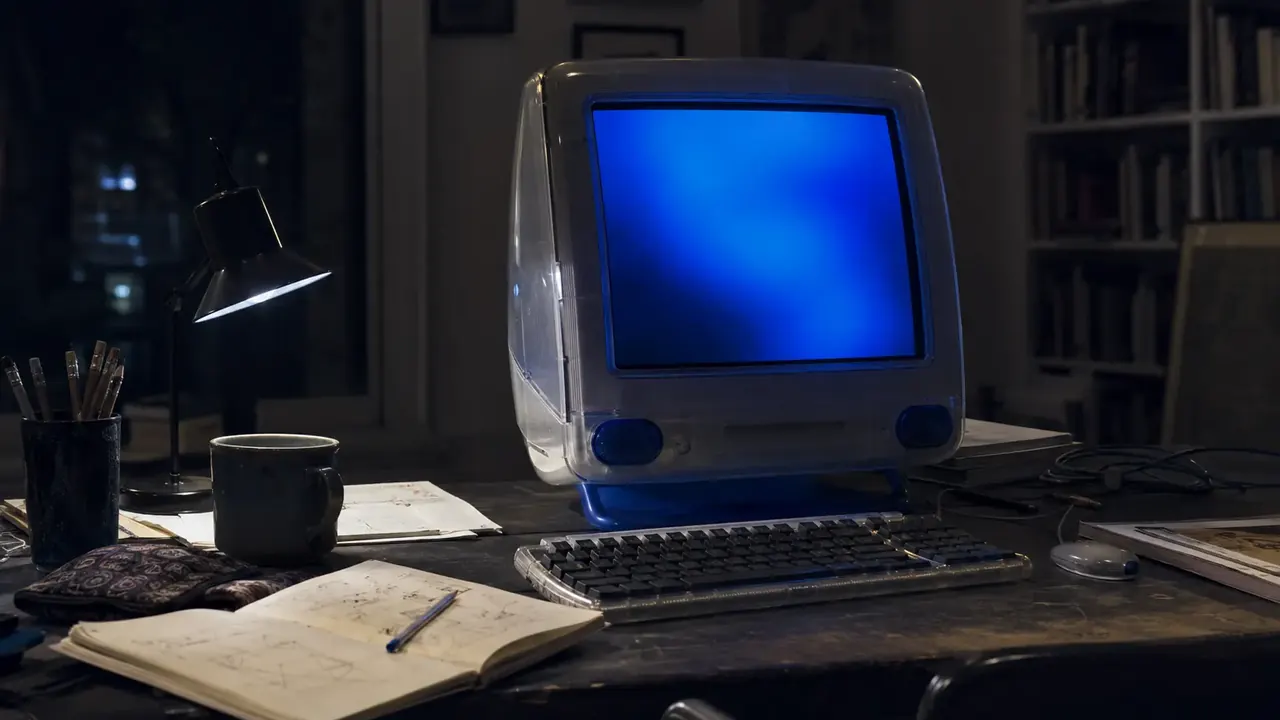
The old web was not elegant. Pages loaded badly, colors fought each other, and somebody was always trying to make text move. But it often felt as if there was a person on the other side of the screen. That part is worth missing.
A page used to feel like a place
The first website was not built to impress anybody. It lived on Tim Berners-Lee’s NeXT computer at CERN and explained the World Wide Web project itself. In 1993, CERN put the web software in the public domain. The important thing was not a visual style. It was that people could make and connect their own pages without waiting for permission.
Later services lowered the barrier further. GeoCities let people build pages around hobbies, fandoms, family news, local clubs and subjects too specific for a publisher to touch. The Internet Archive estimates that GeoCities displayed at least 38 million pages before Yahoo closed it in 2009.
The page did not need to represent a brand. It could simply represent whoever had figured out how to upload it.
Bad design left fingerprints
The blinking words, tiled backgrounds, visitor counters and “under construction” signs were not good interface design. Some were actively unpleasant. The old <blink> element is obsolete, and <marquee> is deprecated for good reasons, including readability and accessibility.
Still, those choices revealed authorship. A hand-picked background or unnecessary animated GIF said, “I wanted this here.” Modern templates solved the chaos. They also made millions of pages look as if the same invisible committee had approved them.
What is actually worth bringing back
Not the flashing text. Not mystery navigation. Not pages that break on a phone. The useful lesson is smaller: give people room to leave fingerprints. Let an article have a strange but relevant detail. Let a section exist because the editor is fascinated by it, not because a keyword tool found volume.
The old web felt human because so much of it was made for the pleasure of making and sharing. A modern publication can keep the speed, accessibility and clean code while recovering some of that motive.
Sources and verification5 sources · evidence for this revision
- CERN: The birth of the Web
- Internet Archive: Early Web datasets and GeoCities
- Internet Archive: GeoCities, Preserved
- MDN: marquee element
- MDN: blink element
Reviewed July 10, 2026. This story distinguishes documented history from editorial interpretation.